Mobile Local Search is growing exponentially & needs responsive web design
 Google recently estimated that 50% of Mobile Search is Local Search based and all the indications are that it may even be higher but one thing is certain, it will continue to increase as more a more tablets and smartphones get used.
Responsive web design for Mobile browsing
Despite this increasing volume of local search queries on mobile devices, the vast majority of small business and even larger brands still don’t have mobile-optimised (or Responsive Web Design [RWD]) sites.
It could be regarded as “marketing madness” but it’s not altogether surprising as the growth of mobile search and particularly local search on mobile has crept up on most business owners.
It’s only in the last year or so that responsive web design techniques started to make an impact on small format mobile device browsing development.
How a Potential Data Disaster proved the value of Responsive Design
A few weeks before Xmas I was unfortunate to experience a disk crash which rendered main machine unusable. It simply wouldn’t boot!
Although not the only machine available it did host most of the applications and data used to run the business.
Having been in the IT industry for many a year in various roles, one being network and data security, should know better, but tend to pay lip service to a proper data backup and recovery procedure.
Fortunately in this instance, the disk was not physically damaged and able to be accessed using data recovery software and a full disk image able to be made on a sector by sector basis as a safety backup measure.
The result was that it took 6 hours before any other remedial work could be done on the disk. Luckily it was successful and the disk able to be fired up again.
Forced to use mobile email & web
During that downtime there was still the need to keep in touch by email and social media.
That was fine but also, did a fair bit of browsing on smartphone as well, and it was only then I realised just how many web sites regularly used were not as user-friendly or usable on such a small format as a mobile phone.
This is a problem as every indication is that mobile email and web browsing is on an exponential trend upward. And, it covered the whole spectrum of sites from major brand names to the corner shop.
How is mobile search impacting on our web sites?
Although we all know mobile search is increasing and no doubt check Google Analytics, or similar, every so often, but we might not have a full appreciation of the impact it might be having.
Decided to check our customer analytics and compare on a year on year basis. The periods compared were December 2011 with December 2012. Chose 9 which spanned a range including ecommerce, lead generation, B2C, B2B and a visitor attraction.
735% increase in mobile search
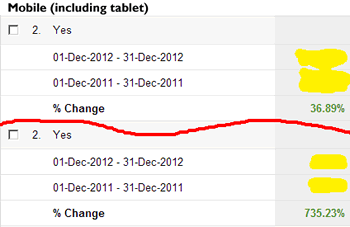 All showed 100%+ increases (104, 117, 131, 160, 175, 232, 455) bar one at 37% (ecommerce) with the highest showing a large 735% rise (visitor attraction).
Was slightly surprised that both ecommerce sites showed the lowest increases, not so much the visitor attraction as the highest, only the actual size of the increase.
Tablets browsing ahead of smartphones
Eight showed increases across the range of device resolutions with the highest increases in the tablet ranges with the very lowest resolution mobile devices either being absent or showing drops.
The only site where this split was different was the visitor attraction which showed the highest increases (735%) mainly in the smartphone resolution ranges.
This site also showed an 257% increase in unique visitors in the period compared with almost 5x the increase represented by mobile.
Downside or opportunity
The downside is that, as all these sites are relatively well established, none are as yet mobile-friendly!
Although this may not be a major issue in the short term as most of their visitors arrive from desktop search and even on tablet browsers are reasonably useable this is likely to change over time and users become more demanding.
Opportunity to future-proof your web site
Responsive design is not a ‘magic bullet’ or panacea but for the majority of businesses could well be the answer helping them to achieve a level of useability across the widest range of devices/resolutions, helping to future-proof their web sites.
It’s a journey and will take time and effort but one worth taking. There is no better time than now to start!