The continuing evolution of the Amazon shopping cart!
Wrote a piece away back in 2009 titled If Amazon is so successful just copy them!
The main point was that Amazon’s site had never really undergone a redesign as many do when trying to improve their ecommerce performance but has evolved through a process of testing and incremental change.
In another post questioning the need for a redesign Amazon’s evolutionary process was again highlighted as an alternative option to a complete redesign.
As another example of that process, the post below by Bryan Eisenberg, highlights that process through a continuous testing regime that weeds out the least effective cart configurations in favour of the one that is best adapted to their user’s expectations and needs.
Hidden Secrets of the Amazon Shopping Cart 2.0
 You may be in a test cell right this moment.
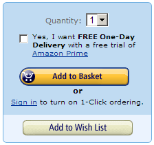
Go to Amazon.com, search for a book and look at their add to cart button, ready to buy area. Is the background of the box white or blue?
Amazon is doing a significant test to their add to cart button and the area surrounding it, what I call the “ready to buy” area.
This is the first major test of this area I have seen in years.
In 2008, I chronicled in an old blog post, my addictive nature by sharing my collection of Amazon Add to Cart button and accompanying area screenshots I have been collected since the late 90s.
Let’s look at the evolution of this critical first stage of the checkout process to see what you can learn from it before we look at the current test.
Link: Hidden Secrets of the Amazon Shopping Cart 2.0 via bryaneisenberg.com